Action-Based Ticketing System

Action-Based Ticketing System

Action-Based Ticketing System

The Brief

UniSouk is a B2B SaaS e-commerce platform that needed a structured support system to handle user issues like refunds, returns, and order disputes — without relying on live chat.

As the sole designer, I owned the end-to-end design of this ticketing system, from early structure to final handoff-ready UI.

PROBLEM

PROBLEM

Most support systems are built around conversations — users message, agents respond.

But UniSouk required a different approach:
support requests needed to be structured, action-based, and tied directly to transactions.

The challenge was:

How do you make a user feel supported without a conversational interface?

How do you make a user feel supported without a conversational interface?

Users needed to resolve refunds, returns, and disputes through structured actions instead of live chat.

RESEARCH

RESEARCH

I analyzed tools like Zoho and Intercom to understand existing ticketing patterns and where they fall short for a non-chat-based system.

Key Insights

Key Insights

  • Table-based layouts improve scanability for ticket lists

  • Ticket detail pages must surface status, priority, and order context upfront

  • Activity timelines help users understand progress without real-time replies

  • Table-based layouts improve scanability for ticket lists

  • Ticket detail pages must surface status, priority, and order context upfront

  • Activity timelines help users understand progress without real-time replies

  • Grouped related fields to improve hierarchy

  • Simplified form structure to reduce cognitive load

  • Prioritized key ticket information above the fold

Design Approach

Design Approach

Design Approach

Due to tight timelines, I started directly with digital wireframes instead of paper sketches, focusing on structure-first thinking.

I iterated closely with product and engineering teams to refine usability:

Due to tight timelines, I started directly with digital wireframes instead of paper sketches, focusing on structure-first thinking.

I iterated closely with product and engineering teams to refine usability:

KEY DESIGN DECISION

KEY DESIGN DECISION

The biggest challenge was designing a ticket view that shows all critical information without overwhelming the user.

Each ticket needed to clearly communicate:

  • Order details and products involved

  • Reason for the ticket

  • Status, timestamps, and progress updates

  • Attachments (if required)

The goal was a single, self-contained view that reduces back-and-forth navigation.

KEY ITEARTION

From modal to inline activity history

Initially

I explored showing the complete activity history in a modal so users could view previous updates without adding more content to the main ticket page.
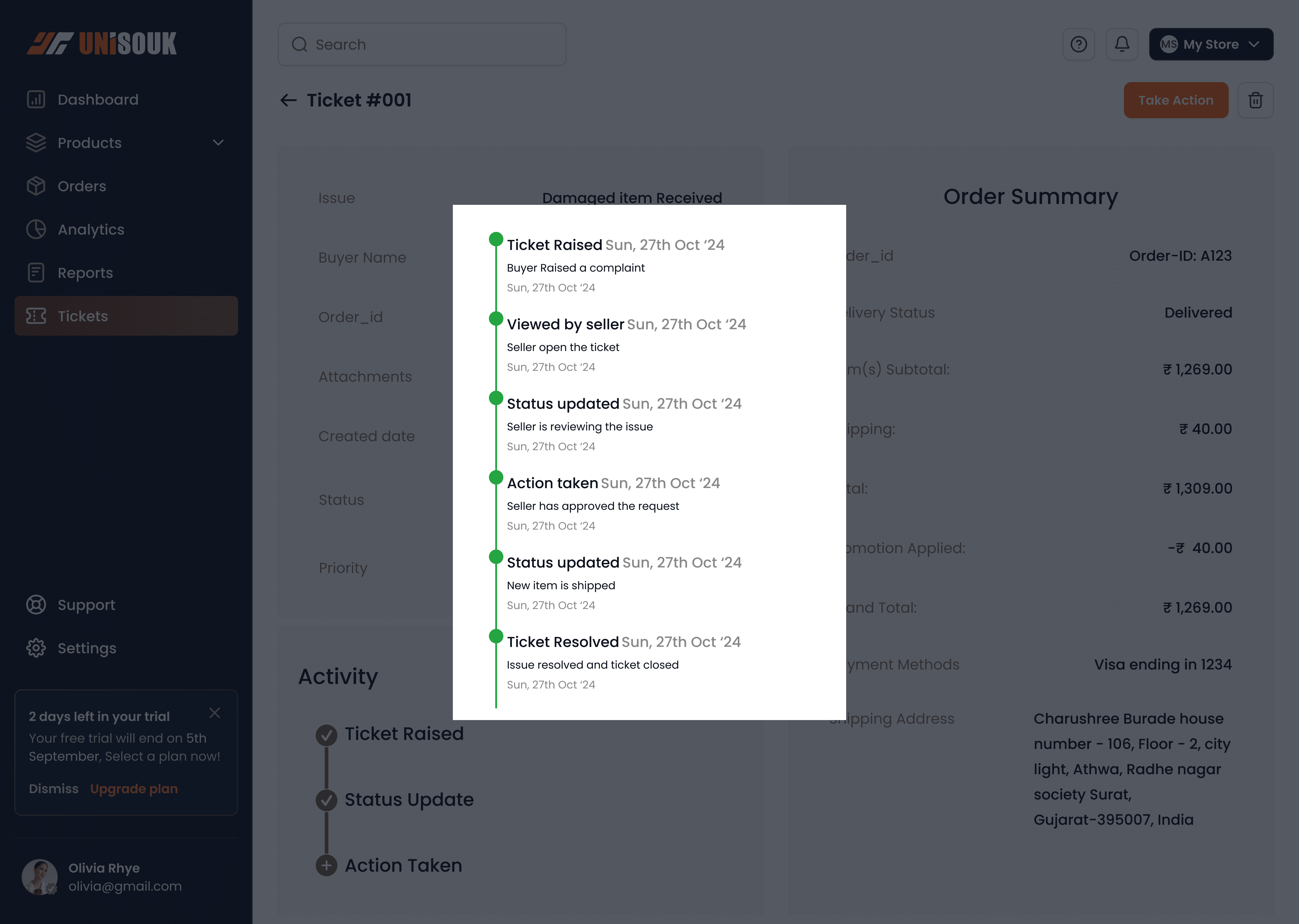
During reviews, the product and engineering teams pointed out that the product already relied on several pop-ups. Adding another modal could make the workflow feel fragmented and force users to move in and out of context.

During reviews, the product and engineering teams pointed out that the product already relied on several pop-ups. Adding another modal could make the workflow feel fragmented and force users to move in and out of context.

Changed to

I redesigned the activity history as an expandable section directly within the ticket details page.

I redesigned the activity history as an expandable section directly within the ticket details page.

Why

This kept users in the same context while still allowing them to access deeper information only when needed. It also reduced unnecessary overlays and made the ticket-review flow feel more continuous.

This kept users in the same context while still allowing them to access deeper information only when needed. It also reduced unnecessary overlays and made the ticket-review flow feel more continuous.

RESULTS

RESULTS

Delivered a responsive ticketing experience that structured support requests around clear actions, status, and transaction context.

Internal stakeholders responded positively to the clarity and usability of the proposed flow.

All within a compact, readable, responsive interface.

Interactive Prototype

Interactive Prototype

Desktop version

Desktop version

Mobile version

Mobile version

Reflection

Reflection

  • Structure first helped me move faster under tight timelines.

  • Competitive research was useful for identifying patterns to avoid, not just copy.

  • Working closely with product and engineering improved my ability to make trade-offs quickly.

Next Steps🚀

Next Steps🚀

  • Automate ticket status updates to reduce manual follow-ups

  • Introduce AI-based ticket tagging for faster categorization

  • Explore optional human chat for complex edge cases

© 2026 charushree burade

© 2026 charushree burade

© 2026 charushree burade

Create a free website with Framer, the website builder loved by startups, designers and agencies.