LONG STORY SHORT
I led the design of a new multi-tag search experience to improve how users discover and filter content in a people-led platform.
Explore the live product: SWOICE
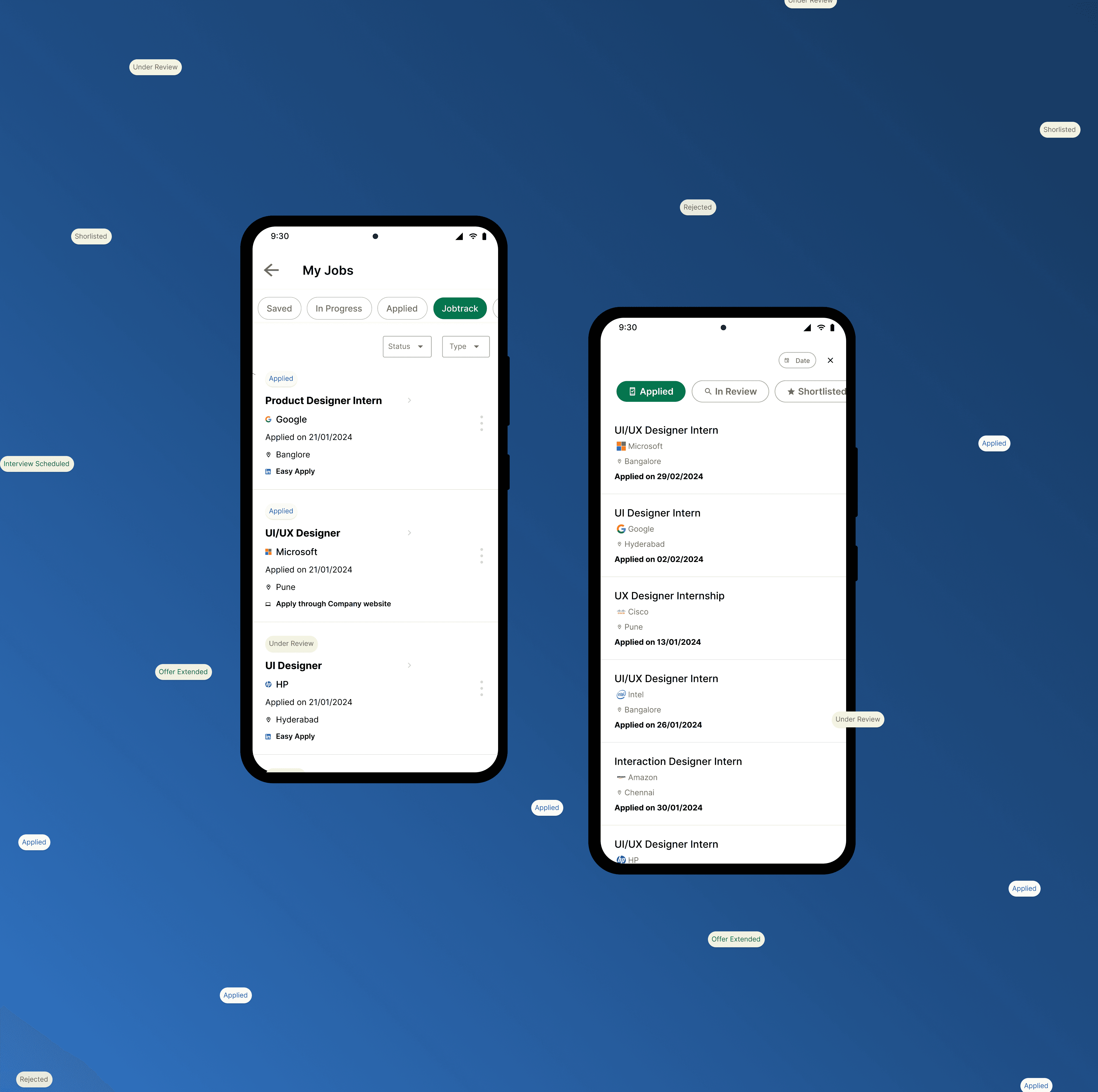
To understand existing search behaviors, I explored how content discovery works across popular platforms.

Based on market insights and core user needs, I defined the key areas for the MVP to improve content discovery and interaction.
The focus was to create a more personalized and structured experience for users interacting with the platform.
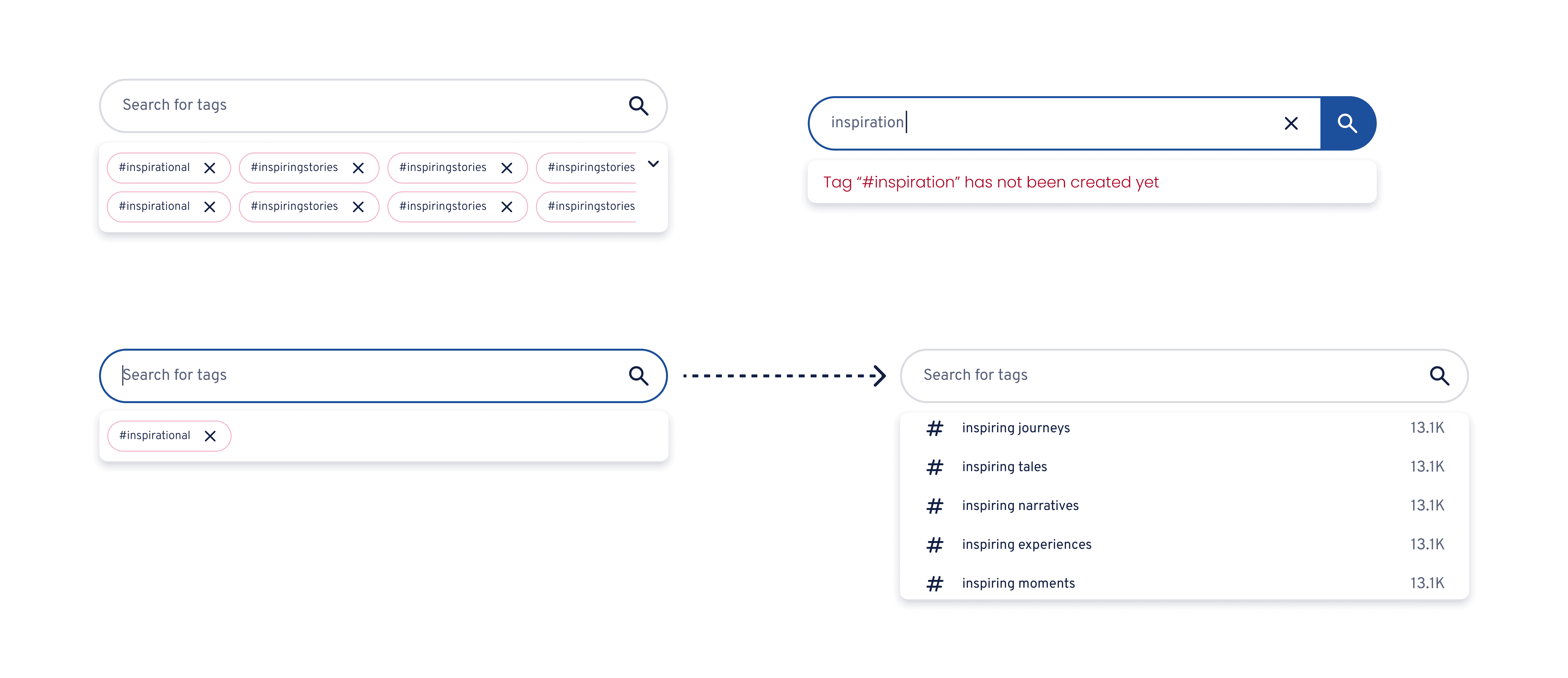
Add multiple tags within one search query.
Add or remove tags without resetting previous selections.
Update results dynamically as the query changes.
Support multiple search intents within one interaction.
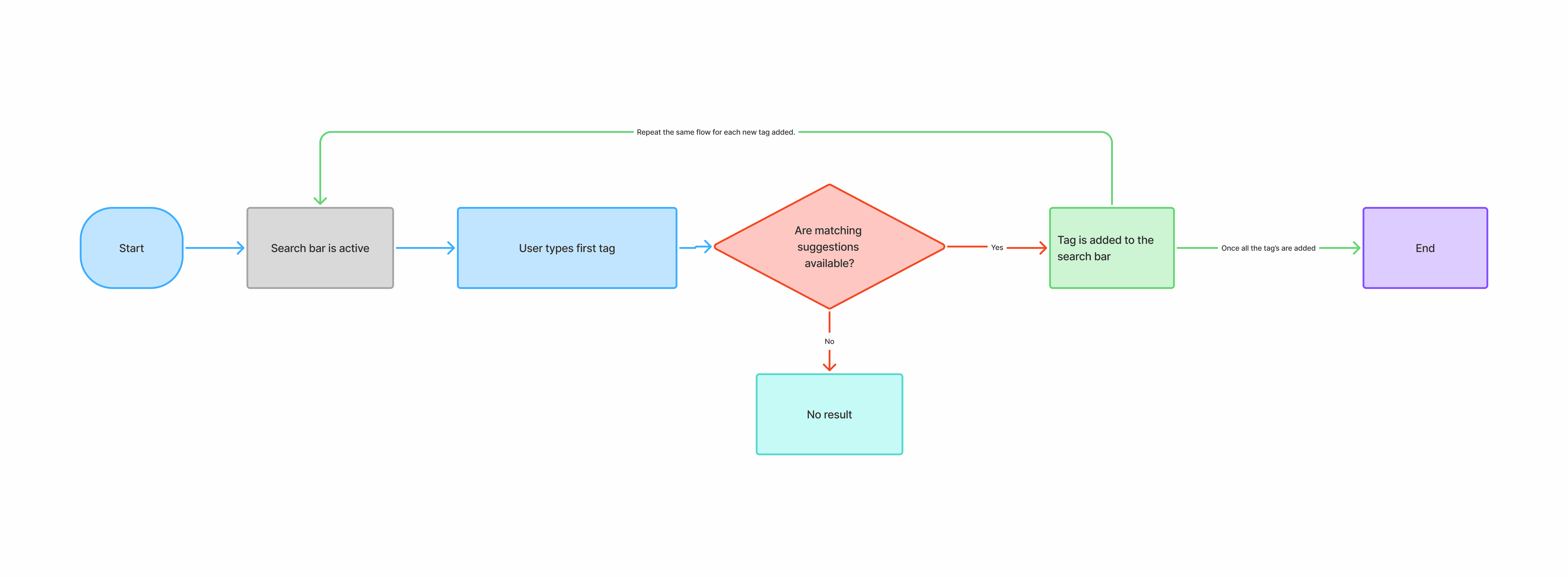
The flow was designed to let users progressively build and refine a query without restarting the search.
The experience was designed around a simple idea:
Users should be able to combine multiple interests without restarting their search.
🔍
Users begin by entering a keyword or interest.
🏷
Users can progressively add multiple tags to refine their intent.
💡
System shows relevant tag suggestions while typing.
⚡
Results update instantly as tags change.
From Initial Concept to Refined Design
I developed and presented the initial concept to stakeholders and product managers to gather feedback on the search flow and interactions. Based on their feedback, I refined the design while keeping the core goal of making multi-tag search intuitive and easy to use.
Initial Concept
In this design, I’ve added the tag directly inside the search field. I initially felt this would be a good approach because it keeps the experience consistent with how users search for and add tags.
My main goal was to make the flow feel familiar and consistent for users, so they can easily understand how it works.

A little peek into our design meet 👀✨ Where ideas were shared, pixels were debated, and good design conversations happened!

A design change after the review
My first idea was to show selected tags inside the search bar. But during the design review, a few questions came up:

This makes the tags easier to view and manage without overwhelming users.
The final experience focused on making multi-intent search feel lightweight across desktop and mobile, while keeping tag addition, removal, and refinement visible and immediate.
The shipped experience enabled users to combine and refine multiple tags without restarting their search, creating a more flexible content-discovery flow.
⏱️
Tight timelines taught me to prioritize interaction structure before visual exploration.
🔍
Search is a system of input, suggestion, selection, and refinement—not a single action.
🧠
Immediate visual feedback is important when users add or remove tags because it helps them understand how the query is changing.
Next Up….